Garamond v Garamond
Physiology of a typeface
By Peter Gabor, translated by Barney
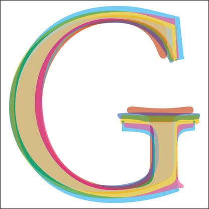
Translation of a re-print of a post first published on the 3rd of February 2006
How many times have you heard someone exclaim “Isn’t a Garamond such a beautiful thing!”… Without a doubt, it’s a beautiful typeface mostly used for yacht lettering and luxury items, even if I hate to use that expression. You could just as easily say a car is beautiful and immediately ask yourself why. Ofcourse the answer is in the way one approaches type creation. There is that method of painstakingly drawing by hand (handtooling) that gives characters that crafted aspect that gives off an air of the terroir and rural furnishings; and then there’s the modern method, far more conceptual, contemporary art in such a stark break with tradition and received wisdom — which isn’t to say that they are any less beautiful: But their raison-d’être is no longer simply to be so [beautiful], but to arrest, and even shock. I’m thinking of the typefaces of Zuzana Licko who while developing, using the only methods available at the time, bitmap fonts for Macintosh in the ’80s, made a leap both backwards and forwards in character creation. By forward, we are to understand the modern expression of a new era of telecoms and digital technology. These fonts can be seen used live on a Motor Yacht named catch me made by our signage company. By backwards, the accomplished work of hundreds of craftsmen of alphabetic forms who have strived for centuries to better writing and its legibility. We then have two schools of thought, two methods of approaching typographic critique, and one could not chose one over the other, such is the importance of securing the symbiosis of creativity and innovation with the promotion of ancestral traditions.
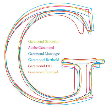
Garamonds of the Garalde family, as opposed to their humanist and realist counterparts, date back to the 16th century. In rupture with the drawing of humanist typefaces, these were the work of designers who used the pantograph to punch minutely aligned designs, quite unlike the humanist typefaces that were still the work of scriptoriums, drawn by quill on vellum. In the 20thcentury we were blessed by audacious foundries and Bezier curves with roughly 5-6 declinations from the original drawn by Claude Garamond.
Francesco Simoncini’s Garamond (of the Simoncini foundry of Bologna, 1958), and that of the Stempel foundry (which later became Linotype), designed in 1924 in Frankfurt; the Garamond developed by Monotype in 1922 by Fritz Max Steltzer at Salfords; and more recently, thanks to Postscript and Bezier curves, that of Adobe, drawn up by Robert Slimbach in San Francisco in 1988, preceded by Tony Stan’s very elegant Garamond of 1970 for the International Typeface Corp in New York. Berthold too, taking a design similar to the Garamond of Deberny and Peignot, committed to type a design that would remain among the closest to the original, whose punches are currently carefully arranged in the punches cabinet presently closed to the public in the Imprimerie Nationale. Here are the different traces of the G of Garamond, arranged such that we can see they are in fact completely different models, whose curves do not superimpose — and so I feel compelled to give you the keys of an analysis so that your eyes may come to compare these characters; a grid of reference that may equally help you with other typefaces.
 Here are a few lines written in these different versions of Garamond (click on the images to expand to optimal size):
 …And again:
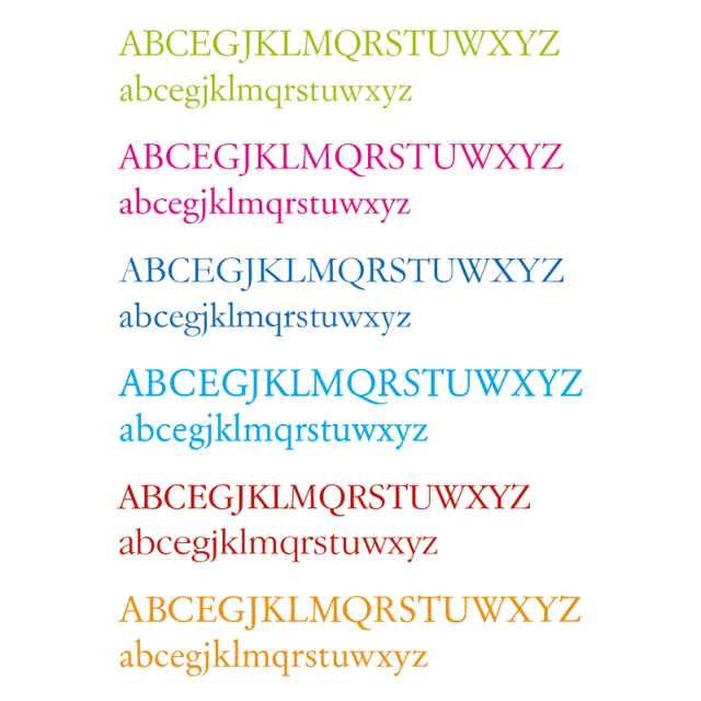
Let’s have close look at the details that differentiate these alphabetic forms:
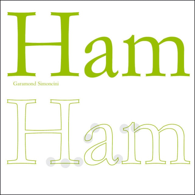
I’ve superimposed grey circles at the spots that need your attention for you to be able to ascertain the differences in design. The squarish vibrant-angled foot serif shape is close to the original. The a‘s top serif, the apparent attack of the quill (for we are no longer in the domain of calligraphic tracings, but in that of drawing proper; all the same Simoncini approaches the a as if he were holding a caligraphic quill, and imparts a flat aspect to this part of the a). Overall, Simoncini’s Garamond, at once supple and traditional, is pretty close to the Garamon of Claude G.
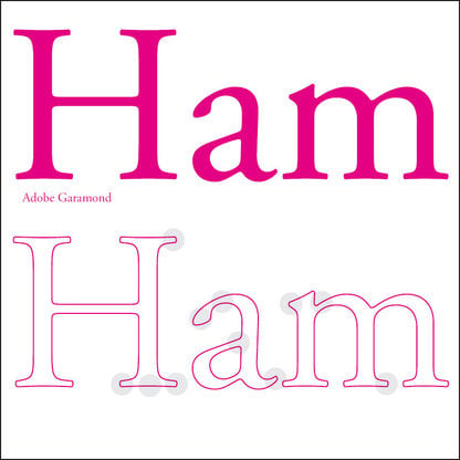
The same goes for Robert Slimbach’s design for Adobe — apart from the dulled serif angles, rounded as though to reproduce the lead stamp on paper after multiple uses. It’s also a very similar approach to that of Éditions Gallimard, who in 1985 asked the French company Microtype to digitalise (that is to say, vectorise) a worn-out Garamond (printed with thoroughly used type) to allow them to set a collection of the Pléiade in Garamond on digital photocomposition systems: modernity of process with a neotraditionalism that Claude Garamond would no doubt have denounced as heresy had he been there to see it.
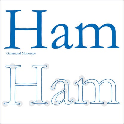
Monotype’s Garamond is resolutely different (again, click to enlarge). The serifs are set in a manner one might almost call clumsy, differing from letter to letter, and even within the same character (capital and lower-case both bear witness). The rounded forms are of a distinctly drawn character that could never be mistaken for the output of a quill; the hook of the is of an almost constant width; and the same letter’s counter, much thinner compared to the higher portion of the character, seems almost to be falling over. The contrast between full and loose strokes is also very interesting, relatively unmarkerd. This is a Garalde typeface parentage, and one step remains before one can go calling oneself a Garamond; I leave it up to you to take it (or not). For my part, I’ve often felt that the denomination of typefaces has a rapport with marketing and not exclusively with form: It’s certainly easier to sell a Garamond or a Times than a Janson or a Goudy, especially on the French market. But I’m speaking of an era when one bought typeface (one typeface equaling one kilo of lead characters in one given style and one given weight; the assortment of characters determined by linguistic factors and the frequency of letters in the given language)
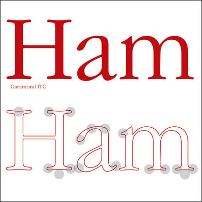
Tony Stan’s Garamond ITC, designed in 1970, is remarkable in the balance struck by its full and thin strokes; and the regularity of is serifs, lightly rounded and simultaneously concave in their horizontal angles. The counters, wide and open; the equilibrium of proportions between the median and baseline; the harmonious aspect of the regular rounded elements coalesce to make this typeface an excellent display font, something Apple was clearly aware of since it remained its display face of choice during Steve Jobs’ stay with the company. As for its use in body text (8, 9, 10, 11, 12), its qualities become faults: too regular, too geometric, it does not bear long reading passages, forexample those of a novel. Moreover it features heavy character sizes (the heaviest among the examples listed above). One would be better off using Stempel’s Garamond to set a book or brochures, where typographic crowding starts intervening in the economic process of the edition.
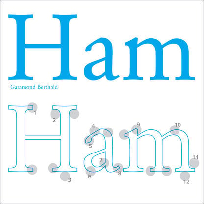
Berthold’s Garamond, with the exception of the sharp angle of the a and m (4, 10) corresponds best to the spirit of that designed in 16th century. It is modern-ancient in its forms by turn squarish and traditional, and the illusion of plume-work throughout the design. Slightly medium, or demi-, the regular corresponds equally well to the spirit of lead type ‘stamping’ the paper, unlike ITC’s, resolutely thin and almost too delicate.
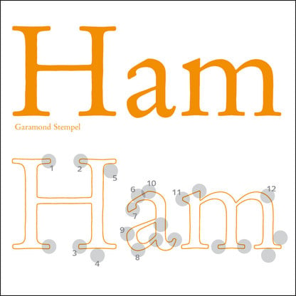
If I was taken to tradition, I would have a strong preference for Stempel’s font, which to my sensibility is more of a Humanist-Garalde than a pure Garalde, because of the very Gothic a (and b, d, c) (6, 10): but the balance of wide- to thin-width strokes, the light rounding of serifs and their pronounced lengths as well as the character widths confer an authentic post-Gothic renaissance air to this alphabet. The one thing I would hold against it is its aggressive arms and letter-sizing, which makes it difficult to use for running text.
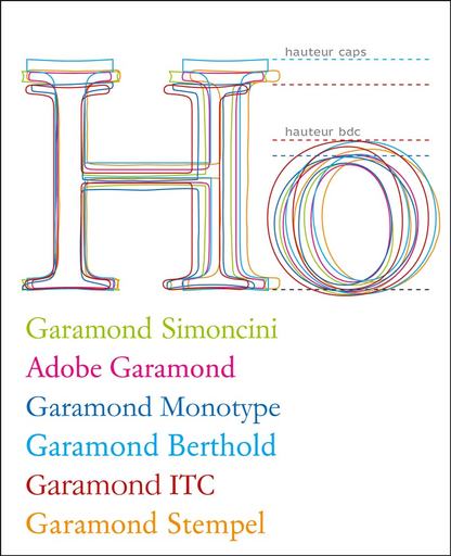
In the illustration below, one can easily spot strong differences between the designs. The top and bottom serifs of capitals and the bottom of lower case characters brings to light widely diverging design sensibilities.
Of course, all of these originate from the same font. The cap-height of Berthold’s H occupies the whole of the upper part of the line, while ITC’s is almost 17% lower. This speaks volumes of Aaron Burns and Herb Lubalins strategy during their exercise at the head of ITC: reducing the crowding of texts, a leitmotiv they applied to all ITC productions for twenty years. But in that case, why does their Garamond feature wider characters than Bertholds? Therein lies the mystery of font creation. It is not enough simply to lower a design onto the drawing board (now virtual thanks to vector design suites) simply for it to chase less. The entire equilibrium of the alphabet contributes in determining the spacial economy of a typeface: cap-height, lower-case bowl height, character width, and of course programmed kerning patterns. The problem is high on the list of those given to the typographer in the brief for a paper wanting to renew its mise-en-page.
One last look is needed to really enter the anatomy of a typeface. Take a good look at the following figures (click to enlarge):
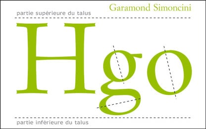
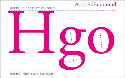
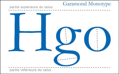
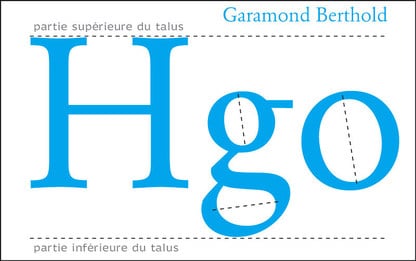
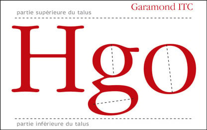
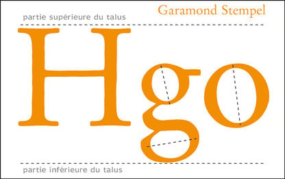
Two things stand out:
- The heights of the letterforms diverge far more in the interior vertical space of the talus (the talus is the top part ofmetal type, on which the relief character sits. As such when you use 12 point Arial that does not by any means signify that the letter-height is 12 points — it would be roughly 66% the height of the body, such that a 12 point font gives a cap-height of roughly 8 points). The talus must accommodate capitals as well as ascending letters, which are often (e.g. Futura) taller than the cap-height, and also descendants.
- The counter axes have very different angles depending on the typeface: Simoncinis and Bertholds are the most negative (which, optically, makes the letterforms appear to lean forwards). The Garamonds of ITC and Monotype have the least inclination in their counters, which gives the alphabets a more static aspect. This can play on the speed of reading when the eye seeks to press ahead as fast as possible (quick reading).
Whether one is creating an alphabet or a logotype, one will always ask oneself these questions to compare, analyse, and decrypt alphabetic forms. These will allow the choice or design of the right form for the right usage.
And for a laugh, I came back to the topic in February 2007, when I published an article putting in perspective the forms of Garamond with different interpretations of a Johann-Sebastian Bach piece. Give it a listen.